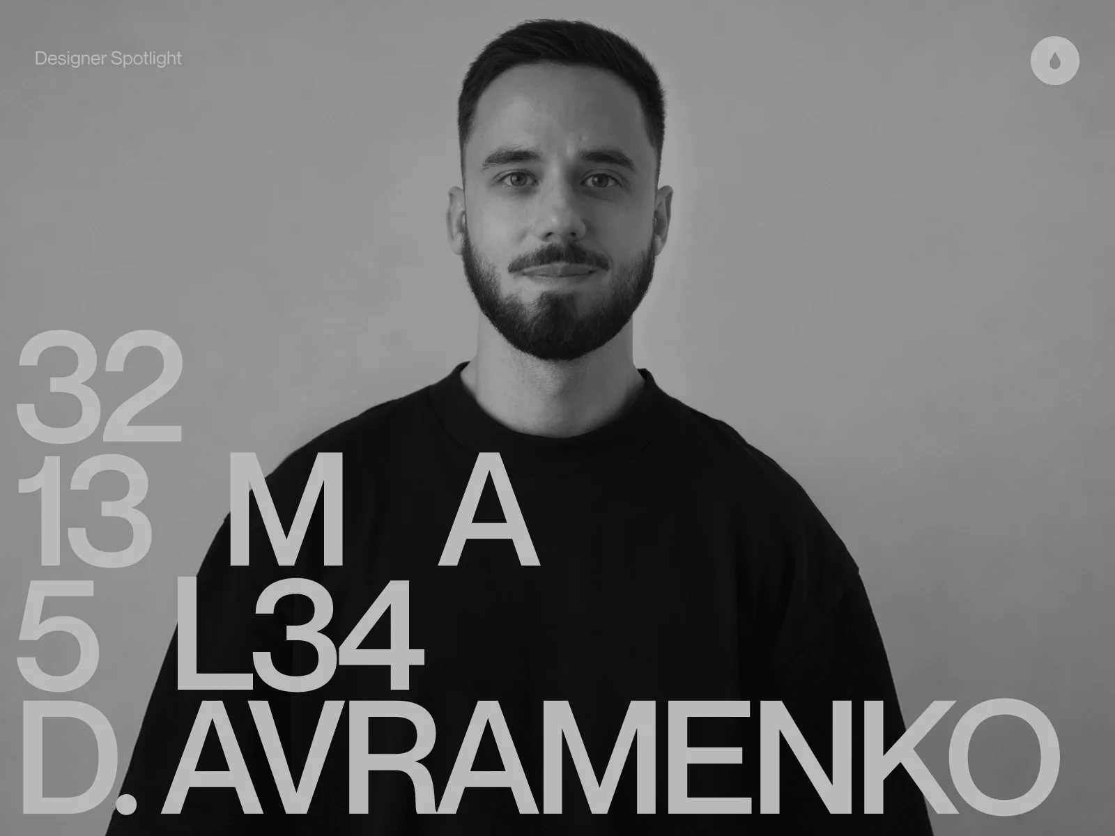
Denis Avramenko is an award-winning art director, digital and motion designer focused on creating interactive experiences, websites, and digital products. Originally from Ukraine and now based in New York, Denis has worked with Fortune 500 companies, global sportswear brands, and tech companies.
He is a member of the International Academy of Digital Arts and Sciences (IADAS) and a jury member at Awwwards, The Webby Awards, and The Lovie Awards.
Denis’s approach to design is shaped by motion, typography, and visual storytelling. He focuses on creating narratives that combine visual exploration with strategic thinking.
Let’s take a closer look at his selected projects and creative process.
Featured work
13 MAL
13 MAL is a curated design space bringing together furniture, lighting, and objects selected for their materiality, form and refined approach to contemporary design.
This is one of my favorite projects because it gave me the freedom to explore and experiment throughout the process. I had the opportunity to be involved in every stage—from defining the overall direction and strategy to shaping the visual details and post-production. Many of the final decisions came from simply testing different approaches, trying new ideas and seeing where the process could go. Sometimes constraints help shape strong ideas, but in this project, having the freedom to explore led to unexpected solutions.
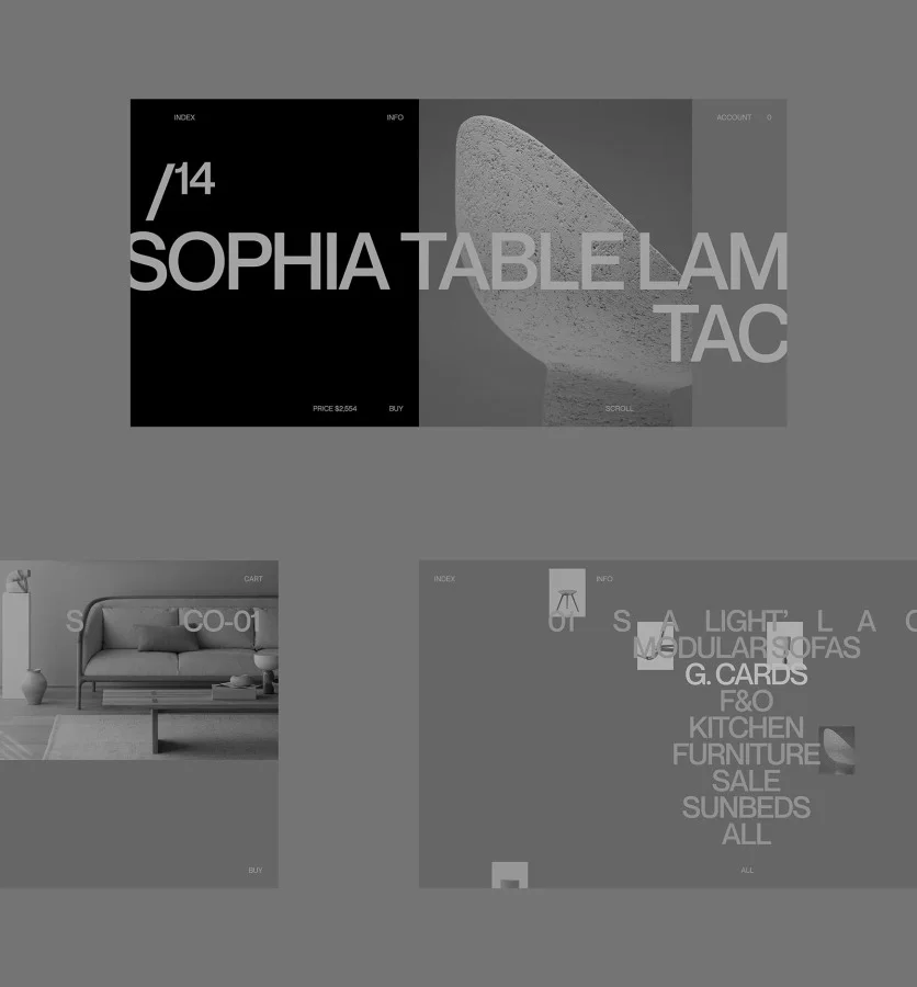
The challenge was to preserve the sense of materiality, character and attention to detail of the collection—creating a space that goes beyond displaying objects and communicates the feeling behind them.
The visual identity extended into the interface, where structure and interaction became part of the same language. I explored the modularity of the system through layered combinations, testing how different elements could work together. The entire system remains black and white, shifting focus toward rhythm, density, repetition, spacing and pacing.
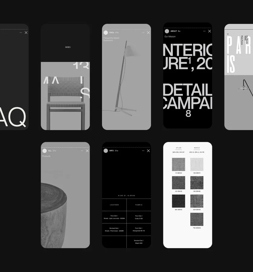
A big part of the process was refining each image to fit the overall visual direction. I worked with levels, contrast and tones to create a consistent look across all images.
I like playing with tones, especially when the images and the background can become one. Placing grey objects on grey backgrounds allows me to create minimal contrast between them. This is one of my favorite techniques that I often use in my work.
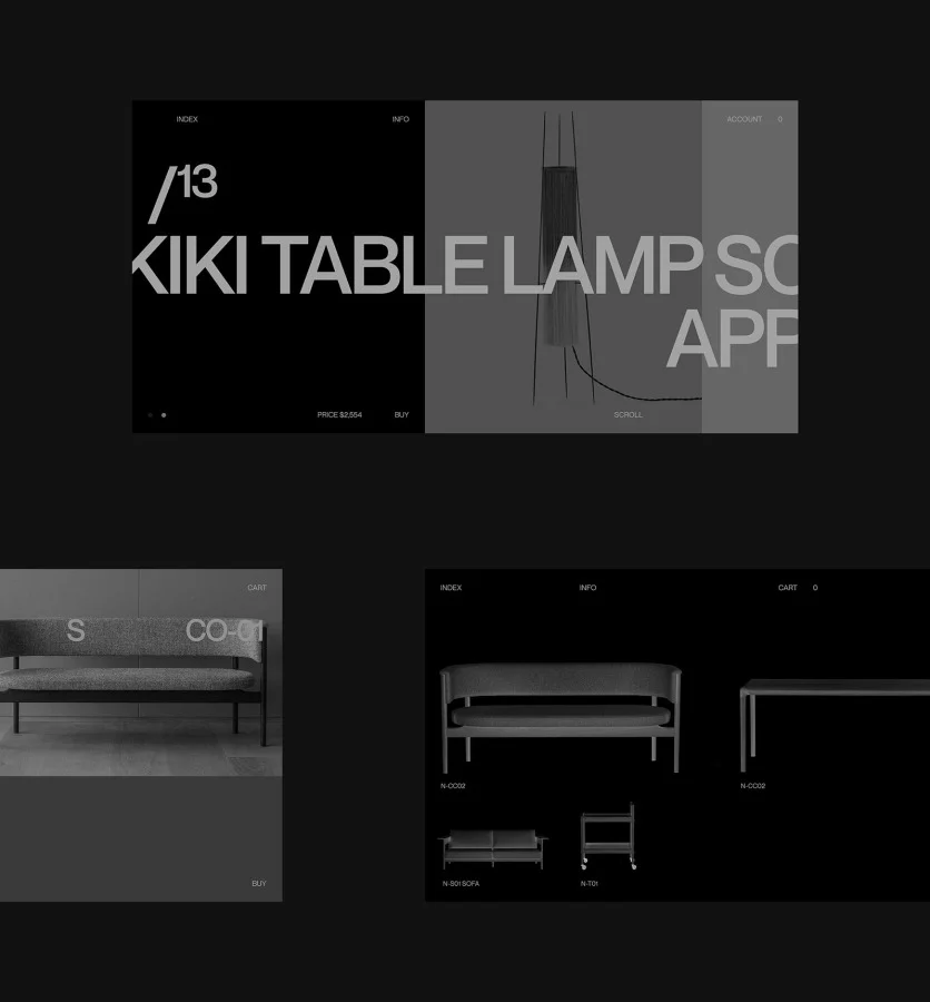
One example of this approach—I didn’t like how some grey images looked on a dark background, both visually and conceptually, so I inverted them to create darker objects on darker backgrounds. These decisions became part of the visual language of the brand. The project includes many examples of low-contrast compositions, where the object and the background feel like part of the same space.
Another challenging part of the project, which is currently in progress, is building a headless commerce experience with Shopify Plus and Next.js. The goal is to combine a flexible digital architecture with a more immersive way of exploring products, including AR functionality that allows users to preview each piece in their own space in real time.
The project was featured on Best of Behance. You can explore the full case study here.
2000 Avenue of the Stars—CBRE Inc. (Fortune 500)
Located in Los Angeles, 2000 Avenue of the Stars is a 750,000-square-foot landmark destination that combines architecture, premium office spaces, retail, dining and cultural amenities. The project redefines the modern workplace through a balance of design, functionality and luxury.
Rachel Many from Alietum Studio invited me to collaborate on this project. The goal was to translate the essence of the property into a digital presence that reflects its architectural identity and premium positioning.
An interesting part of the project is that I didn’t start with the usual approach of creating the homepage and building the structure around it. Instead, I started with motion and typography, exploring how the elements could behave and create structure and space.
I developed a conceptual behavioral system built around typography, translating the architectural character of the building into a digital environment. By introducing depth and dimension, the system creates a connection between the physical and digital space.
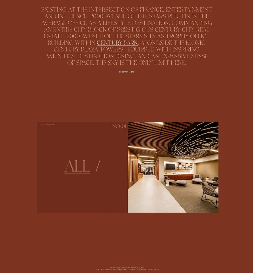
Slow-paced animations, flowing transitions and animated typography with subtle 3D rotations were designed to reflect the building’s luxury aesthetic, creating a sense of elegance, balance and continuity across every touchpoint.
You can explore the full case study on Behance.
X8
For X8 Eyewear, I explored how typography and dynamic transitions could become a key part of the visual identity—using scale, distortion and movement to create a dialogue between structure and transformation.
Working closely with a co-founder of X8 and former CEO of Gentle Monster, we developed a new direction. The project focused on building a complete digital and motion system—from visual identity and typography to UX/UI and creative development, including GSAP-powered animations and an AR virtual try-on experience.
The goal was to create a brand that is self-sufficient, independent and strong on its own. The identity reveals its philosophy. X means collaborating and connecting. 8 means circulation and infinity. Literally.
The brand was built around an unshakable, unchanging foundation and endless transformation. At the same time, it evolves through dynamic and fluid collaborations. Each collection-collaboration follows the idea of a chameleon, transforming its typographic style while becoming part of the X8 world. We create a universe of endless dynamic changes and possibilities.
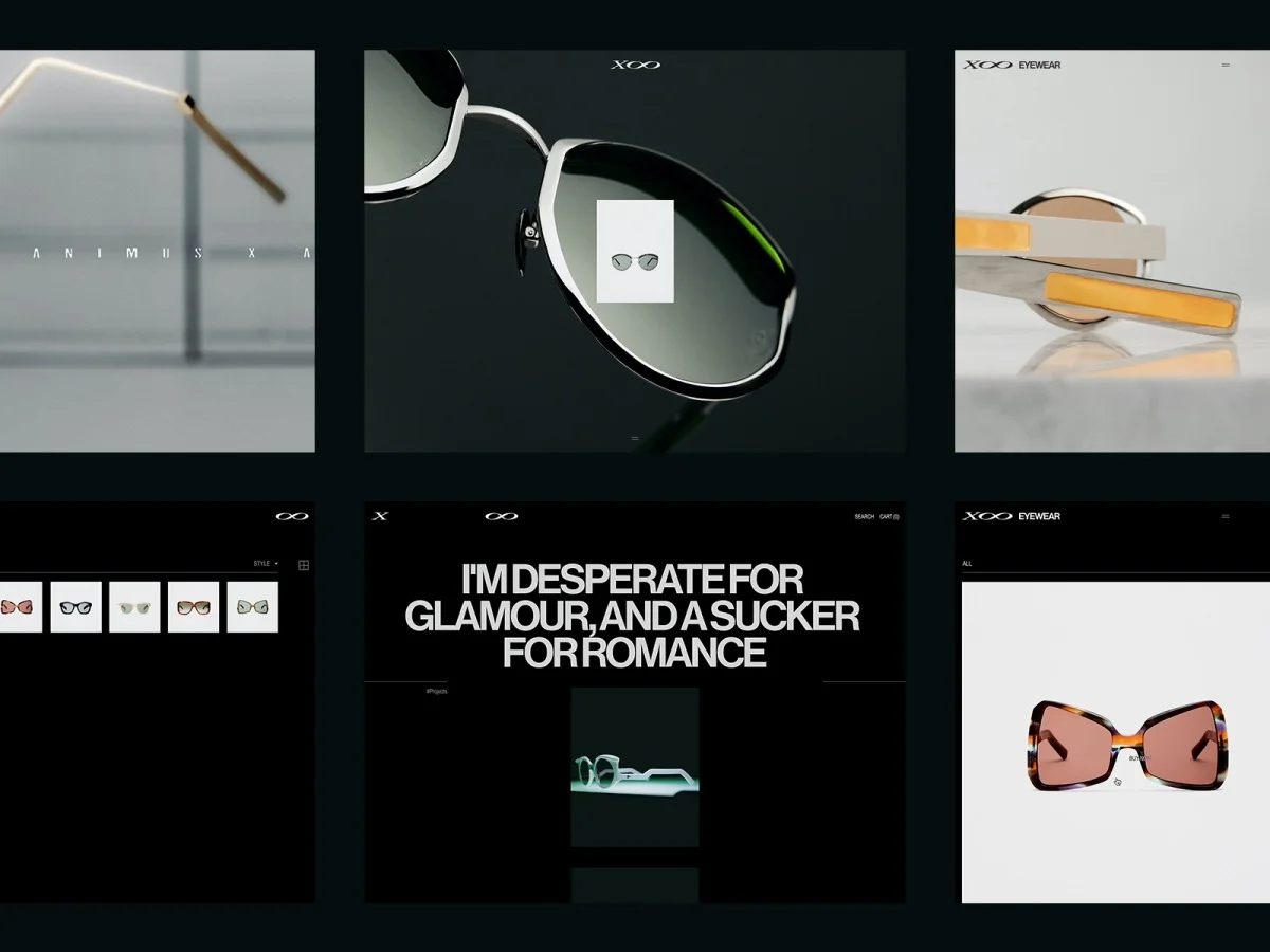
The project received 12 international industry awards, including FWA Site of the Day, CSS Design Awards (Site of the Day, Best UX, Best UI, and Innovation), CSS Winner Site of the Day, The Ecommerce Design Awards Site of the Day, and Mindsparkle Mag Site of the Day.
Behance Case Study
FWA Case
Dominik Tarabanski
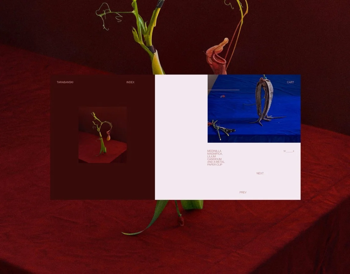
A conceptual e-commerce platform created for photographer and artist Dominik Tarabanski, exploring a more expressive way to present the collection. I experimented with custom layouts, layered compositions and dynamic transitions to create a browsing experience that feels closer to an editorial piece than a traditional online store.
Typography became an additional layer of the visual language, adding a unique character and expanding each artwork beyond the image itself. Motion helped shape the navigation flow, adding movement while keeping the attention on the photography.
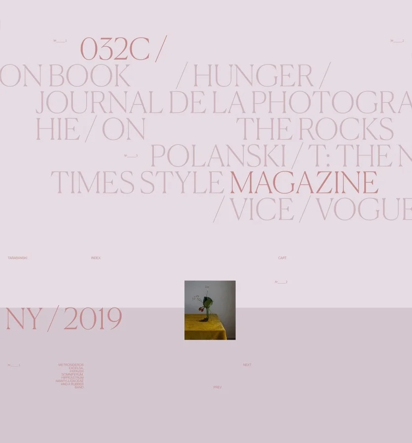
The typography remains fixed at the center of the screen across each page, becoming part of the exhibition itself. The titles also act as navigation elements, opening and closing sections while transitioning seamlessly between art rooms and becoming part of the narrative.
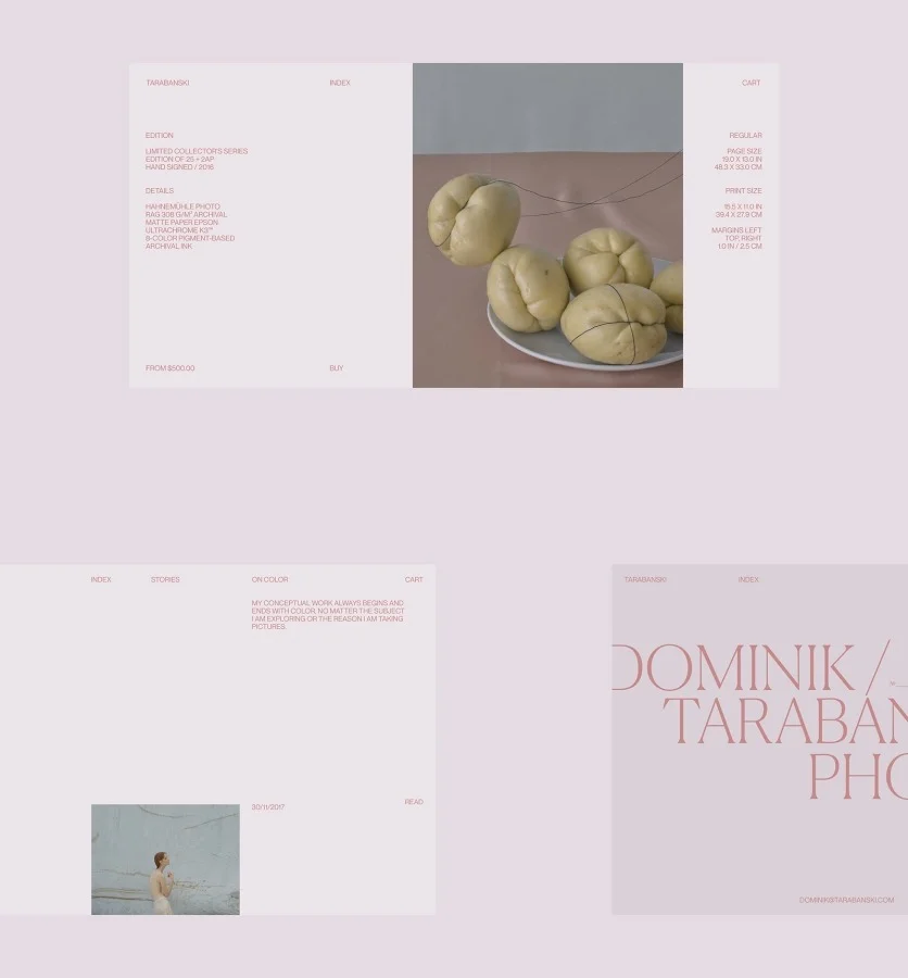
The project was featured on Best of Behance. You can explore the full case study here.
Beyond Design
My journey started with painting and drawing at an art college, long before I entered the world of design. This experience shaped the way I approach design today. Moving into design helped me find the balance between aesthetics and problem-solving—creating not only visual ideas, but also meaningful structures and systems.
Today, my work goes beyond visuals—I focus on building systems, shaping narratives and creating digital products with an interactive layer.
I also have extensive experience leading developers and working closely with the technical side of projects, which helps me understand what is possible and how ideas can be brought to life. Over the years, I’ve worked on many technology-driven projects, experimenting with WebGL, GSAP, Three.js, headless commerce, and other technologies.
Final Thoughts
A big thank you to the Codrops team for featuring my work and giving me the opportunity to share more about my process and the ideas behind my projects. It was a pleasure to reflect on the journey, the decisions behind the work, and the experiences that continue to shape my approach to design.
There are many new projects coming soon and I’m excited to share more of them in the future. Stay connected!
Project inquiries: denis@adencys.com