Chems.Studio is a creative direction and film practice based in New York City. Its work moves between fashion, culture, identity and movement, always searching for honest images and meaningful stories.
I was invited to design and develop a new website for the studio.
The challenge wasn’t to showcase new work, but to organise years of different projects into a single visual language. Campaigns, films, set design, creative direction — every project had its own context, rhythm and purpose. The website needed to bring them together naturally without flattening those differences.
Rather than designing a portfolio, I wanted to design an archive: a place where every project could exist with the same importance, where visitors are free to wander, discover unexpected connections and build their own reading of the work.
A Quiet Structure
The entire website is built around a simple three-column grid. Rather than strictly defining the layout, the grid establishes a rhythm that carries through the experience.
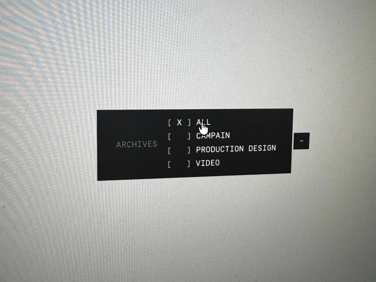
On the homepage, it becomes a full-page vertical sequence. In the archive, it turns into a three-column collection of projects. Individual project pages transform the same structure into a horizontal narrative, allowing images and films to unfold naturally across the screen.
The system never really changes; only its tempo does.
That consistency creates a sense of familiarity, while the different ways in which the grid is used allow each section to retain its own character.
Navigation as Movement
I wanted navigation to feel less like moving from one page to another and more like moving through a physical space.
The homepage and information pages share the same level, while the archive sits slightly aside, almost like another room. Entering it becomes a small shift in perspective rather than simply another click.
Swup.js allows these transitions to happen almost invisibly, creating a sense of continuity rather than interruption. The website can change context without making the user feel as though they have left one experience and entered another.
Building an Archive
Archives usually grow over time, and this one was designed with that in mind.
The visual system is intentionally restrained, allowing new projects to naturally find their place without requiring the identity of the website to change with them. The interface acts more as a framework than a composition: it provides enough structure to connect everything, while leaving enough freedom for each project to retain its own voice.
This became an important distinction throughout the process. The website shouldn’t compete with the work or constantly redefine itself around whatever was most recently added. It needed to be able to absorb change while remaining recognisable.

Image First
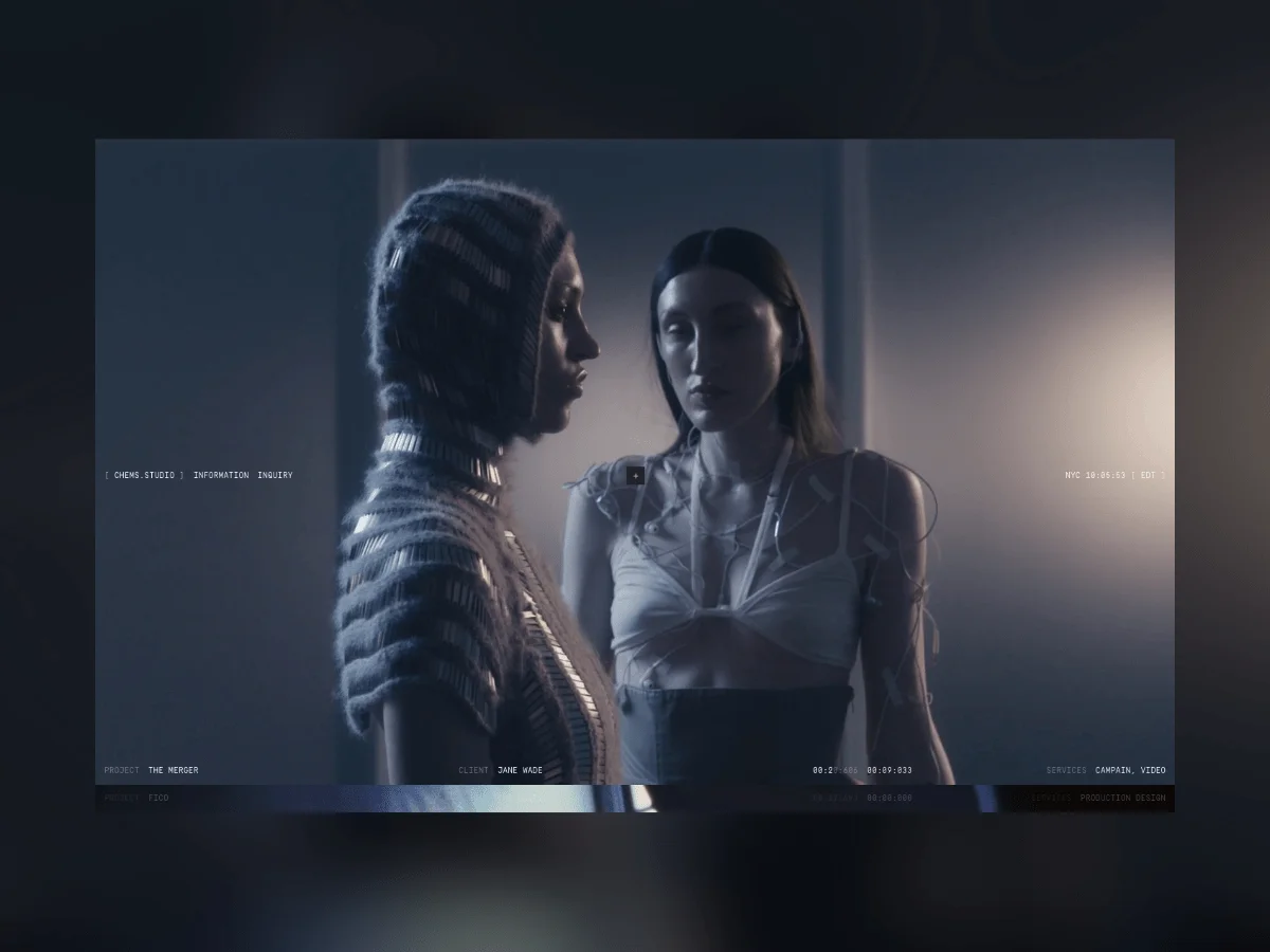
Very little text appears throughout the website. The intention was simple: let the images create the rhythm.
Photography, film and still frames become the primary language, while text only appears when it is needed to provide orientation or context.
In that sense, silence became an important design tool. By removing unnecessary information, the interface leaves more space for the work itself and for the visitor to decide where to look next.
Motion
Movement exists throughout the website, but it rarely asks for attention.
Page transitions remain fluid, images appear without urgency, and small scramble-text animations quietly accompany navigation and interface elements. Together, these details introduce a subtle sense of movement while reinforcing the archival character of the project — as if information were constantly being reorganised and rediscovered.
Nothing loops simply for decoration.
Every animation has a role, whether it is supporting navigation, establishing rhythm or helping the work unfold.
Typography
A monospaced typeface runs through the entire interface, bringing a technical quality that recalls catalogues, production notes and archival references.
It creates an intentional contrast with the expressive nature of the visual work, while giving the website a calm and consistent voice. The typography doesn’t try to compete with the imagery; instead, it quietly holds the system together.
The website was developed using a lightweight stack focused on performance and continuity.
Tech Stack
The website was developed using a lightweight stack focused on performance and continuity.
- Webflow
- Swup.js
- Vimeo API
- Custom Vimeo Player
Webflow allows the archive to grow over time with complete editing freedom. Swup.js keeps navigation continuous, while the Vimeo API and a custom player ensure that every film feels fully integrated into the experience rather than treated as an external piece of content.
Designing for Time
One idea stayed with me throughout the project: creative work is always changing. New campaigns replace old ones, references evolve, and the visual language of a practice naturally shifts over time. The website, however, shouldn’t need to change with every new project.
Rather than following visual trends, I wanted to build something quiet enough to age well — a structure that could welcome new work for years while remaining coherent with what came before. The goal was to create a system that could adapt to the changing nature of the studio without constantly redefining itself.
For me, that is what an archive should do. It shouldn’t simply preserve the past; it should create enough space for what comes next.